
VAIRKKO Form Builder
VAIRKKO Forms Cloud is a web-based, fully-mobile online forms solution. It allows users to create an unlimited number of custom forms, questions and answers while even collecting hand written staff signatures on forms. Create workflow/routing rules to determine which management members should receive/be notified of newly submitted forms.

Overview
iForms, a core feature within the VAIRKKO platform, enables admins to build and manage custom digital forms used across various workflows. This project aimed to evaluate the usability of the existing iForms tool and identify key friction points that were preventing users from efficiently creating and organizing forms. Through targeted usability testing, we set out to uncover pain points in the beta experience and prioritize the most critical improvements for the next design iteration—focusing on streamlining form creation, reducing confusion, and enhancing overall workflow clarity for admin users.
Problem
The original iForms experience posed significant challenges for admin users tasked with building and managing complex forms. The process was unintuitive—requiring users to configure form settings before adding questions—and navigating between separate sections like pick lists, question banks, and settings led to a fragmented workflow. Additionally, features such as “Manage Sections” and a lack of real-time feedback (e.g., no preview or auto-save) disrupted momentum and caused user frustration. Usability testing confirmed these issues, with admins reporting confusion, inefficiency, and a steep learning curve. These insights highlighted a critical need to reimagine the iForms experience from the ground up, with a focus on intuitive workflows, clearer navigation, and scalable functionality that could evolve over multiple design phases.
How might we…
Make the form-building process in iForms more intuitive and flexible, so that admins can create, organize, and manage complex forms without unnecessary friction or confusion?
The process
At VAIRKKO, our product design approach is grounded in the Double Diamond framework and informed by Lean UX principles, allowing us to move efficiently from insight to impact. Across all projects—including the redesign of the iForms experience—we follow the key phases of Discovery, Definition, Ideation, and Implementation. This process helps us deeply understand user pain points, align with cross-functional teams, explore a range of possible solutions, and deliver focused, validated improvements. By integrating continuous feedback loops and rapid iteration, we ensure that our solutions are both user-centered and adaptable to the evolving needs of our platform and users.

Where We Started
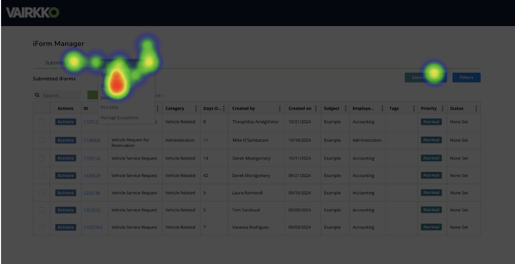
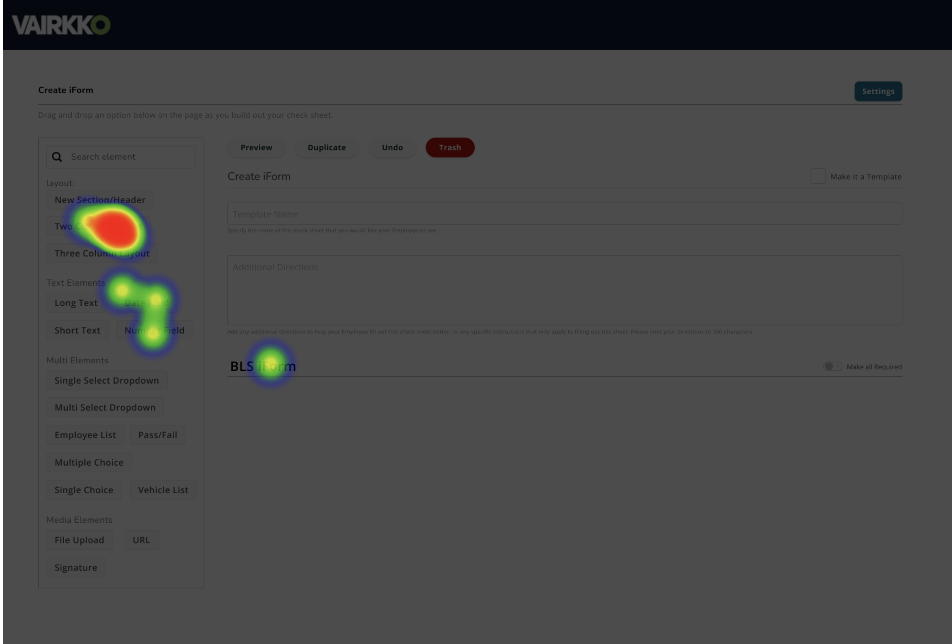
When I joined VAIRKKO as the first UX/UI designer, the iForms tool had already been developed by engineers without any user research or design input. While it met basic functional requirements, the user experience was fragmented and unintuitive. Admins were forced to build forms piece by piece—adding sections and questions one at a time, each through separate steps. There was no cohesive view of the completed form within the builder itself; the only way to see the final version was to access it from the employee-facing side of the platform. This meant that any mistakes or misplacements weren’t visible during the creation process, making editing frustrating and error-prone. Key features were buried across multiple tabs, and the overall flow lacked flexibility, slowing down even simple form-building tasks. To address these issues, I conducted targeted user interviews to uncover the biggest friction points, better understand admin workflows, and measure task success within the existing tool. These insights formed the foundation for a multi-phase redesign focused on clarity, efficiency, and real-time feedback.
Gathering Insights

After conducting a focus group with key iForms users—primarily admins responsible for building and managing forms—I collaborated with my product manager to synthesize the feedback through affinity mapping. We grouped pain points under common themes and specific features within the platform, allowing us to visualize where friction was most concentrated. During the session, we also had participants rate the difficulty of each core feature within the iForms tool on a scale of 1 to 5, giving us quantifiable insight into which areas users struggled with most.
To prioritize which issues to address first, I applied a data-driven approach using the severity framework, which evaluates usability issues based on three key variables: frequency (how often the problem occurs), impact (how seriously it affects the user’s experience), and persistence (whether it blocks task completion or can be worked around). This framework, paired with user difficulty scores, allowed us to rank usability issues by urgency and focus the redesign on areas that would provide the most immediate value to our users.
Identifying Opportunities from User Feedback

During a focused session with key users of the iForms tool, we uncovered several recurring pain points that pointed to deeper structural and workflow issues. Users described the experience as “confusing and overwhelming,” particularly when trying to determine where to start or why certain steps, like configuration, were required before adding questions. The feedback highlighted excessive navigation between tabs, a lack of automation, and an unintuitive setup that failed to reflect the simplicity of newer tools like CheckSheets or WordPress. Several users expressed a desire for reusable global elements to avoid recreating frequently used lists or questions. Others asked for critical form options—like marking a question as a "critical fail" or setting a default response—to be immediately accessible. Finally, features like “Associated Items” were called out for lacking clarity and purpose, often going unused despite their potential value in real-world use cases like audit tracking. These insights revealed powerful opportunities to streamline, declutter, and modernize the iForms experience by focusing on clarity, reusability, and efficiency.
High-Fidelity Prototype Preview
This early high-fidelity prototype brought the redesigned iForm builder to life, translating core usability improvements into a more polished interface. The video below showcases updates such as a more intuitive form creation flow, simplified layout, and newly added features like reusable components and inline critical fail options. These designs began to bridge the gap between user expectations and the previous clunky experience.
Validating Designs
To evaluate the effectiveness of the redesigned iForms experience, I ran unmoderated usability tests using Lyssna. Participants were tasked with creating a new iForm using the drag-and-drop functionality in the updated design. This allowed them to explore the interface independently while generating click data and open-ended feedback.
The results revealed several key friction points. Some users instinctively looked for a dedicated “Settings” page to manage templates, mirroring mental models from platforms like WordPress. Others expected to find a “bulk edit” function, suggesting a need for better feature visibility. While drag-and-drop interactions were intuitive to some, others found them clunky or difficult to control, especially on smaller screens. The clean column layout also raised concerns around mobile usability.
Despite areas for improvement, the potential impact of the redesign was clear: 50% of users estimated it would save them 60–74% more time, 25% said it would save 45–59%, and the remaining 25% expected at least a 0–15% time savings. These insights directly shaped the next phase of iteration, focusing on usability, discoverability, and mobile optimization.

Results & Takeaways
Since rolling out the redesigned iForms tool, we've seen a noticeable drop in support tickets related to form creation and navigation—clear evidence that the new experience resolved major pain points. Feedback from users has been overwhelmingly positive, with many reporting significant time savings and greater confidence in building forms without needing extra guidance.
This redesign wasn't just a visual refresh—it fundamentally improved how users create, edit, and manage iForms. I consolidated the previously fragmented steps for setup and management into a more intuitive flow and introduced updates to how end users (employees) experience the form itself, ensuring consistency from creation to submission.
Some key takeaways from this project include:
Plan for an MVP early. Having a clear MVP strategy helped us stay focused, prioritize high-impact features, and manage out-of-scope requests that could have derailed progress or bloated timelines.
User testing doesn't end at launch. Iteration is ongoing. Continuous feedback through unmoderated testing and user interviews revealed unexpected friction points, enabling us to fine-tune the experience post-launch.
Bring engineering in early. Collaborating with developers from the start ensured we understood platform limitations and possibilities, reducing rework and aligning design with technical feasibility.
This process reinforced that great UX is not just about interface design—it's about thoughtful planning, listening to users, and building partnerships across teams. The following high-fidelity mockups represent the culmination of iterative feedback, technical collaboration, and a deep understanding of user needs brought to life.


